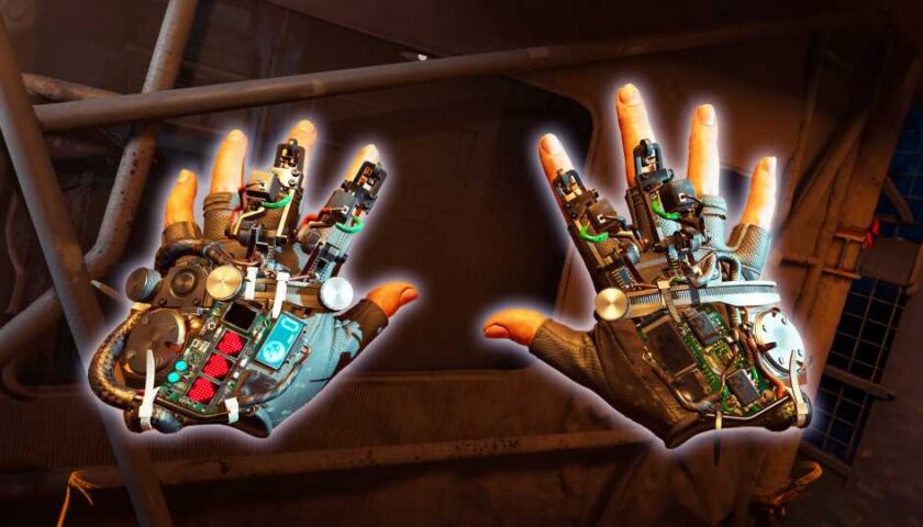
In Inside XR Design we examine specific examples of great VR design. Today we’re looking at the details of Half-Life: Alyx and how they add an immersive layer to the game rarely found elsewhere.
You can find the complete video below, or continue reading for an adapted text version.
Intro
Now listen, I know you’ve almost certainly heard of Half-Life: Alyx (2020), it’s one of the best VR games made to date. And there’s tons of reasons why it’s so well regarded. It’s got great graphics, fun puzzles, memorable set-pieces, an interacting story… and on and on. We all know this already.
But the scope of Alyx allows the game to go above and beyond what we usually see in VR with some awesome immersive details that really make it shine. Today I want to examine a bunch of those little details—and even if you’re an absolute master of the game, I hope you you’ll find at least one thing you didn’t already know about.
Inertia Physics
First is the really smart way that Alyx handles inertia physics. Lots of VR games use inertia to give players the feeling that objects have different weights. This makes moving a small and light object feel totally different than a large and heavy object, but it usually comes with a sacrifice which is making larger objects much more challenging to throw because the player has to account for the inertia sway as they throw the object.
Alyx makes a tiny little tweak to this formula by ignoring the inertia sway only in its throwing calculation. That means if you’re trying to accurately throw a large object, you can just swing your arm and release in a way that feels natural and you’ll get an accurate throw even if you didn’t consider the object’s inertia.
This gives the game the best of both worlds—an inertia system to convey weight but without sacrificing the usability of throwing.
I love this kind of attention to detail because it makes the experience better without players realizing anything is happening.
Sound Design
Note: Make sure to unmute clips in this section
When it comes to sound design, Alyx is really up there not just in terms of quality, but in detail too. One of my absolute favorite details in this game is that almost every object has a completely unique sound when being shaken. And this reads especially well because it’s spatial audio, so you’ll hear it most from the ear that’s closest to the shaken object:
This is something that no flatscreen game needs because only in VR do players have the ability to pick up practically anything in the game.
I can just imagine the sound design team looking at the game’s extensive list of props and realizing they need to come up with what a VHS tape or a… TV sounds like when shaken.
That’s a ton of work for this little detail that most people won’t notice, but it really helps keep players immersed when they pick up, say, a box of matches and hear the exact sound they would expect to hear if they shook it in real life.
Gravity Gloves In-depth
Ok so everyone knows the Gravity Gloves in Alyx are a diegetic way to give players a force pull capability so it’s easier to grab objects at a distance. And practically everyone I’ve talked to agrees they work exceptionally well. They’re not only helpful, but fun and satisfying to use.
But what exactly makes the gravity gloves perhaps the single best force-pull implementation seen in VR to date? Let’s break it down.
In most VR games, force-pull mechanics have two stages:
- The first, which we’ll call ‘selection’, is pointing at an object and seeing it highlighted.
- The second, which we’ll call ‘confirmation’ is pressing the grab button which pulls the object to your hand.
Half-Life: Alyx adds a third stage to this formula which is the key to why it works so well:
- First is ‘selection’ where the object glows so you know what is being targeted.
- The second—let’s call it lock-on’—involves pulling the trigger to confirm your selection. Once you do, the selection is locked-on; even if you move your hand now the selection won’t change to any other object.
- The final stage, ‘confirmation’, requires not a button press but a pulling gesture to finally initiate the force pull.
Adding that extra lock-on stage to the process significantly improves reliability because it ensures that both the player and the game are on the same page before the object is pulled.
And it should be noted that each of these stages has distinct sounds which make it even clearer to the player what’s being selected so they know that everything is going according to their intentions.
The use of a pulling gesture makes the whole thing more immersive by making it feel like the game world is responding to your physical actions, rather than the press of a button.
There’s also a little bit of magic to the exact speed and trajectory the objects follow, like how the trajectory can shift in real-time to reach the player’s hand. Those parameters are carefully tuned to feel satisfying without feeling like the object just automatically attaches to your hand every time.
This strikes me as something that an animator may even have weighed in on to say, “how do we get that to feel just right?”
Working Wearables
It’s natural for players in VR to try to put a hat on their head when they find one, but did you know that wearing a hat protects you from barnacles? And yes, that’s the official name for those horrible creatures that stick to the ceiling.
But it’s not just hats you can wear. The game is surprisingly good about letting players wear anything that’s even vaguely hat-shaped. Like cones or even pots.
I figure this is something that Valve added after watching more than a few playtesters attempt to wear those objects on their head during development.
Speaking of wearing props, you can also wear gas masks. And the game takes this one step further… the gas masks actually work. One part of the game requires you to hold your hand up to cover you mouth to avoid breathing spores which make you cough and give away your position.
If you wear a gas mask you are equally protected, but you also get the use of both hands which gives the gas mask an advantage over covering your mouth with your hand.
The game never explicitly tells you that the gas mask will also protect you from the spores, it just lets players figure it out on their own—sort of like a functional easter egg.
Spectator View
Next up is a feature that’s easy to forget about unless you’ve spent a lot of time watching other people play Half-Life: Alyx… the game has an optional spectator interface which shows up only on the computer monitor. The interface gives viewers the exact same information that the actual player has while in the game: like, which weapons they have unlocked or equipped and how much health and resin they have. The interface even shows what items are stowed in the player’s ‘hand-pockets’.
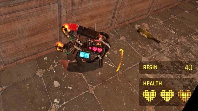
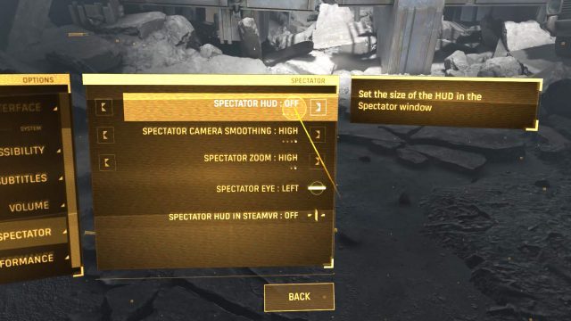
Multi-modal Menu
While we’re looking at the menus here, it’s also worth noting that the game menu is primarily designed for laser pointer interaction, but it also works like a touchscreen.
While this seems maybe trivial today, let’s remember that Alyx was released almost four years ago(!). The foresight to offer both modalities means that no matter if the player’s first instinct is to touch the menu or use the laser, both choices are equally correct.
Guiding Your Eye
All key items in Alyx have subtle lights on them to draw your attention. This is basic game design stuff, but I have to say that Alyx’s approach is much less immersion breaking than many VR games where key objects a highlighted in a glaringly obvious yellow mesh.
For the pistol magazine, the game makes it clear even at a distance how many bullets are in the magazine… in fact, it does this in two different ways.
First, every bullet has a small light on it which lets you see from the side of the magazine roughly how full it is.
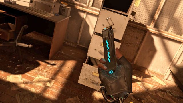
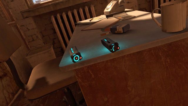
The takeaway here is that a game’s most commonly used items—the things players will interact with the most—should be the things that are most thoughtfully designed. Players will collect and reload literally hundreds of magazines throughout the game, so spending time to add these subtle details meaningfully improves the entire experience.
Continue on Page 2 »
Source: Read Full Article
